%
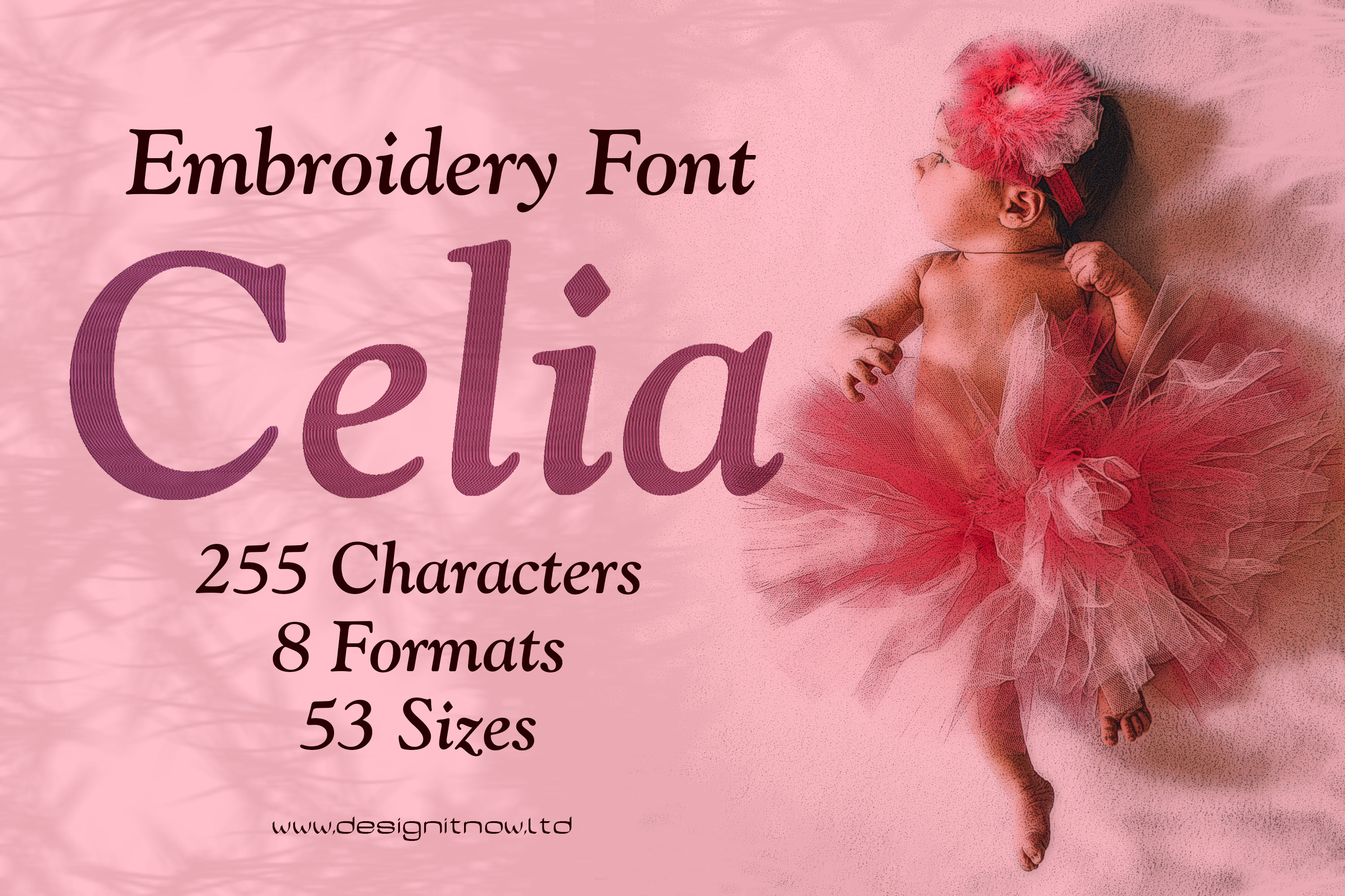
Celia Serif Font
In microtypography, a serif is a short, thin line on the lines of letters and characters, which in antiqua typefaces terminates a letter stroke at the end, at right angles to its basic direction as a horizontal stroke (stroke, foot). The serif typeface is primarily used for the main text of books and magazines, since in printed form this typeface is in many cases less tiring and easier to read than sans serif typefaces. A well-known serif font (also called a serif font) is Times; a well-known sans-serif font is Helvetica. The Duden and the Oxford English Dictionary cite the Dutch schreef "stroke, line" as the presumed word origin, although the word used in German is additionally assumed to be borrowed from the corresponding English word. Depending on where and how the serif ends the stroke of a glyph, a distinction is made between end serifs, roof serifs, head serifs, cross serifs, and stance serifs. Serifs can be one-sided or double-sided. One-sided serifs are also called half serifs. For example, the lowercase letter k has a single-sided badger serif at the top left, a double-sided closing serif at the top right, a double-sided standing serif at the bottom left, and either a single-sided or double-sided standing serif at the bottom right. In microtypography, serifs are referred to in more detail by a variety of other terms, depending on their exact form.Font is a set of characters designed in a specific typeface and realized according to the respective technical conditions. It is used for text creation and processing, typesetting and printing, and forms the basis of typography. A typesetting font consists of individual characters, the glyphs: usually lowercase letters, uppercase letters, umlauts, accented characters, numerals, ligatures, punctuation marks, special characters and small caps. These are assembled manually, by machine or electronically to form words, lines and more complex orders.The scope of such a character set depends on the technology and the intended application radius of a typesetting font. The functional efficiency of the characters of a typesetting script requires, in the case of Western European alphabetic scripts, that they are arranged horizontally, in neighborhood with other characters of the inventory, according to a uniform rhythmic and stylistic principle. Only then can they be combined into a coherent, graphically balanced typeface.The form of typefaces in general, and that of typesetting in particular, is characterized by two different modes of access: Reading and seeing (in the sense of looking). These are due to the "double character of writing." Writing is both abstract (semantic level) and sensuously concrete (semiotic level). In routine reading, attention is focused on the abstract side of writing. Records in alphabetical writing are not deciphered letter by letter, but word and line outlines are grasped holistically by means of eye jumps (saccades). In the process, details of the form of the written image escape attention, recede into the background, and are not registered or are invisible.Product Number: F01400Product Name: CeliaThis design comes with the following sizes:from 1.5" to 8" in steps of 0.125"255 Characters 53 Sizes 8 FormatsThe following formats are included in the file you will receive: .DST .EXP .JEF .PES .VP3 .XXX .PEC .U01You MUST have an embroidery machine and the software needed to transfer it from your computer to the machine to use this file. This listing is for the machine file only - not a finished item.Celia Beautiful Serif Machine Embroidery Font Design, Serif Letters Characters, Serif Font Embroidery Pattern, Font Design, Downloadable Fonts, Alphabet Design, Typography Design, Typeface, Letter Style, Unique Digital Supplies For Embroidery Machines
US$1.10* US$4.40* (75% saved)
%
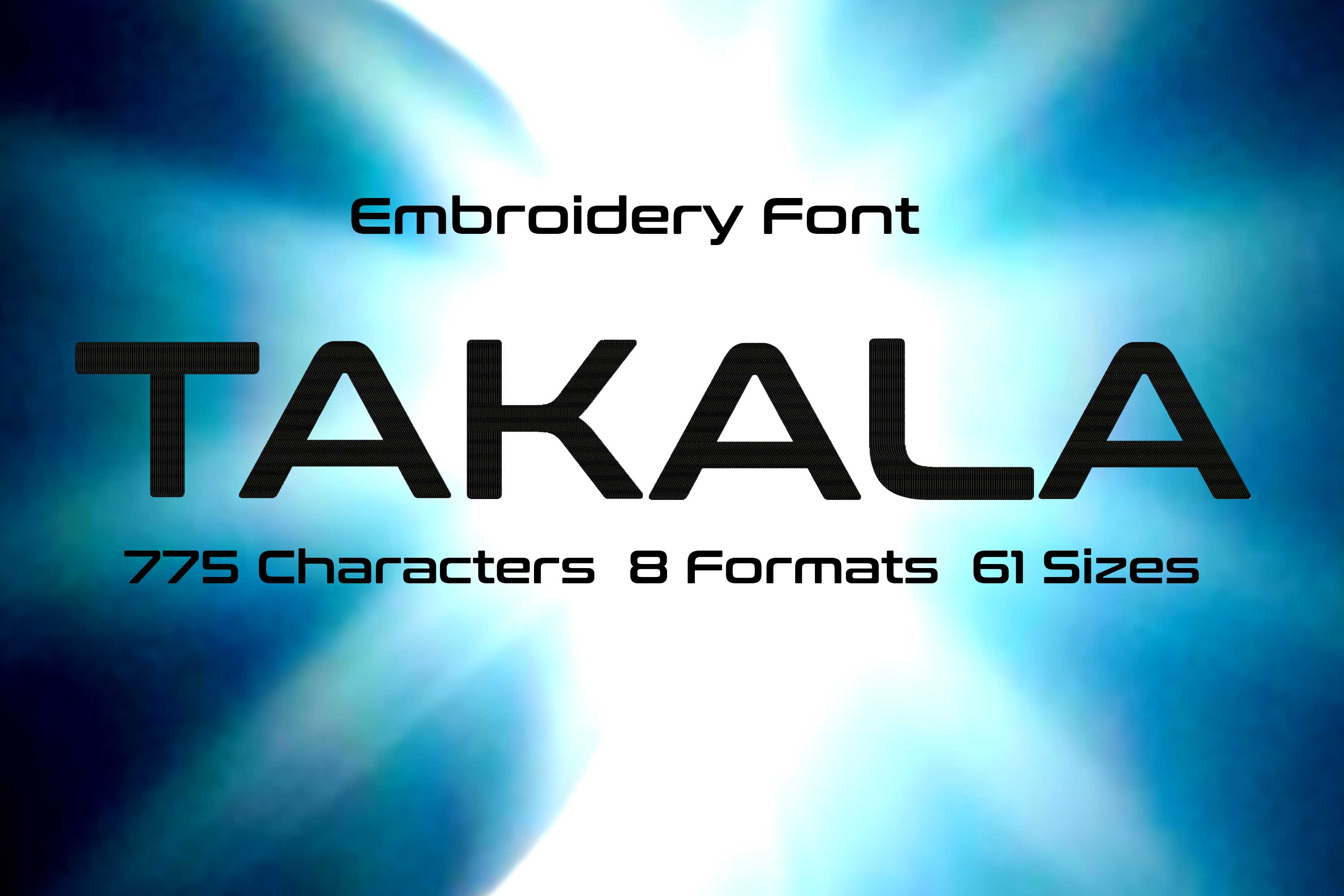
Takala Wide Letters Sans Serif Font
A sans serif (DIN 16518) or grotesque (French for "without serif", "sans serif") is a font family derived from antiqua, which is characterized by the fact that it has no serifs. In addition, in grotesque fonts, the stroke width of the letters is (almost) uniform, so stroke contrast is absent or very slight. The absence of serifs distinguishes grotesque fonts from serifed linear antiqua. The term grotesque is very common among experts. It refers to the fact that the first typefaces of this type were considered grotesque, i.e. a strange but quite charming distortion, because the non-variation of stroke width and the omission of serifs contradicted all reading habits of the time. Grotesque fonts feature simply shaped glyphs that can be easily displayed on screens, among other things. They are therefore standard on computer systems today. Since the widespread use of grotesque fonts, the term Grotesk seems strange, which is why the terms sans serif or Sans Serif are commonly used in the desktop publishing industry.Like Egyptienne, Grotesk originated in England in the early 19th century in response to the increased need for eye-catching advertising typefaces. In 1803, Robert Thorne showed a sans serif for the first time. The first Grotesk was published in 1816 by William Caslon IV, the great-grandson of the type founder William Caslon. At first glance, grotesque fonts have a uniform stroke width. However, this only appears to be the case, because in reality the weights almost always differ in order to create a visually uniform image. Font is a set of characters designed in a specific typeface and realized according to the respective technical conditions. It is used for text creation and processing, typesetting and printing, and forms the basis of typography. A typesetting font consists of individual characters, the glyphs: usually lowercase letters, uppercase letters, umlauts, accented characters, numerals, ligatures, punctuation marks, special characters and small caps. These are assembled manually, by machine or electronically to form words, lines and more complex orders.The scope of such a character set depends on the technology and the intended application radius of a typesetting font. The functional efficiency of the characters of a typesetting script requires, in the case of Western European alphabetic scripts, that they are arranged horizontally, in neighborhood with other characters of the inventory, according to a uniform rhythmic and stylistic principle. Only then can they be combined into a coherent, graphically balanced typeface.The form of typefaces in general, and that of typesetting in particular, is characterized by two different modes of access: Reading and seeing (in the sense of looking). These are due to the "double character of writing." Writing is both abstract (semantic level) and sensuously concrete (semiotic level). In routine reading, attention is focused on the abstract side of writing. Records in alphabetical writing are not deciphered letter by letter, but word and line outlines are grasped holistically by means of eye jumps (saccades). In the process, details of the form of the written image escape attention, recede into the background, and are not registered or are invisible.Product Number: F00554Product Name: TakalaThis design comes with the following sizes:from 0.5" to 8" in steps of 0.125"775 Characters 61 Sizes 8 FormatsThe following formats are included in the file you will receive: .DST .EXP .JEF .PES .VP3 .XXX .PEC .U01You MUST have an embroidery machine and the software needed to transfer it from your computer to the machine to use this file. This listing is for the machine file only - not a finished item.Takala Wide Letters Sans Serif Machine Embroidery Font Design, Grotesque Font Embroidery Pattern, Without Serif Font Design, Downloadable Fonts, Alphabet Design, Typography Design, Typeface, Letter Style, Unique Digital Supplies For Embroidery Machines
US$1.10* US$4.40* (75% saved)
%
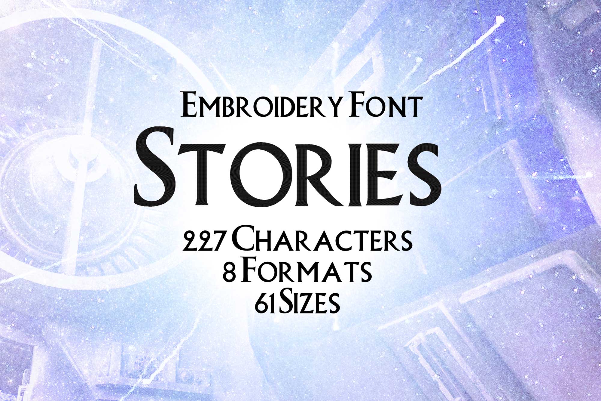
Stories Serif Letters Embroidery Font
In microtypography, a serif is a short, thin line on the lines of letters and characters, which in antiqua typefaces terminates a letter stroke at the end, at right angles to its basic direction as a horizontal stroke (stroke, foot). The serif typeface is primarily used for the main text of books and magazines, since in printed form this typeface is in many cases less tiring and easier to read than sans serif typefaces. A well-known serif font (also called a serif font) is Times; a well-known sans-serif font is Helvetica. The Duden and the Oxford English Dictionary cite the Dutch schreef "stroke, line" as the presumed word origin, although the word used in German is additionally assumed to be borrowed from the corresponding English word. Depending on where and how the serif ends the stroke of a glyph, a distinction is made between end serifs, roof serifs, head serifs, cross serifs, and stance serifs. Serifs can be one-sided or double-sided. One-sided serifs are also called half serifs. For example, the lowercase letter k has a single-sided badger serif at the top left, a double-sided closing serif at the top right, a double-sided standing serif at the bottom left, and either a single-sided or double-sided standing serif at the bottom right. In microtypography, serifs are referred to in more detail by a variety of other terms, depending on their exact form.Font is a set of characters designed in a specific typeface and realized according to the respective technical conditions. It is used for text creation and processing, typesetting and printing, and forms the basis of typography. A typesetting font consists of individual characters, the glyphs: usually lowercase letters, uppercase letters, umlauts, accented characters, numerals, ligatures, punctuation marks, special characters and small caps. These are assembled manually, by machine or electronically to form words, lines and more complex orders.Product Number: F00090Product Name: StoriesThis design comes with the following sizes:from 0.5" to 8" in steps of 0.125"227 Characters 61 Sizes 8 FormatsThe following formats are included in the file you will receive: .DST .EXP .JEF .PES .VP3 .XXX .PEC .U01You MUST have an embroidery machine and the software needed to transfer it from your computer to the machine to use this file. This listing is for the machine file only - not a finished item.Stories Serif Letters Embroidery Font Design, Serif Letters Characters, Serif Font Embroidery Pattern, Font Design, Downloadable Fonts, Alphabet Design, Typography Design, Typeface, Letter Style, Unique Digital Supplies For Embroidery Machines
US$1.10* US$4.40* (75% saved)
%
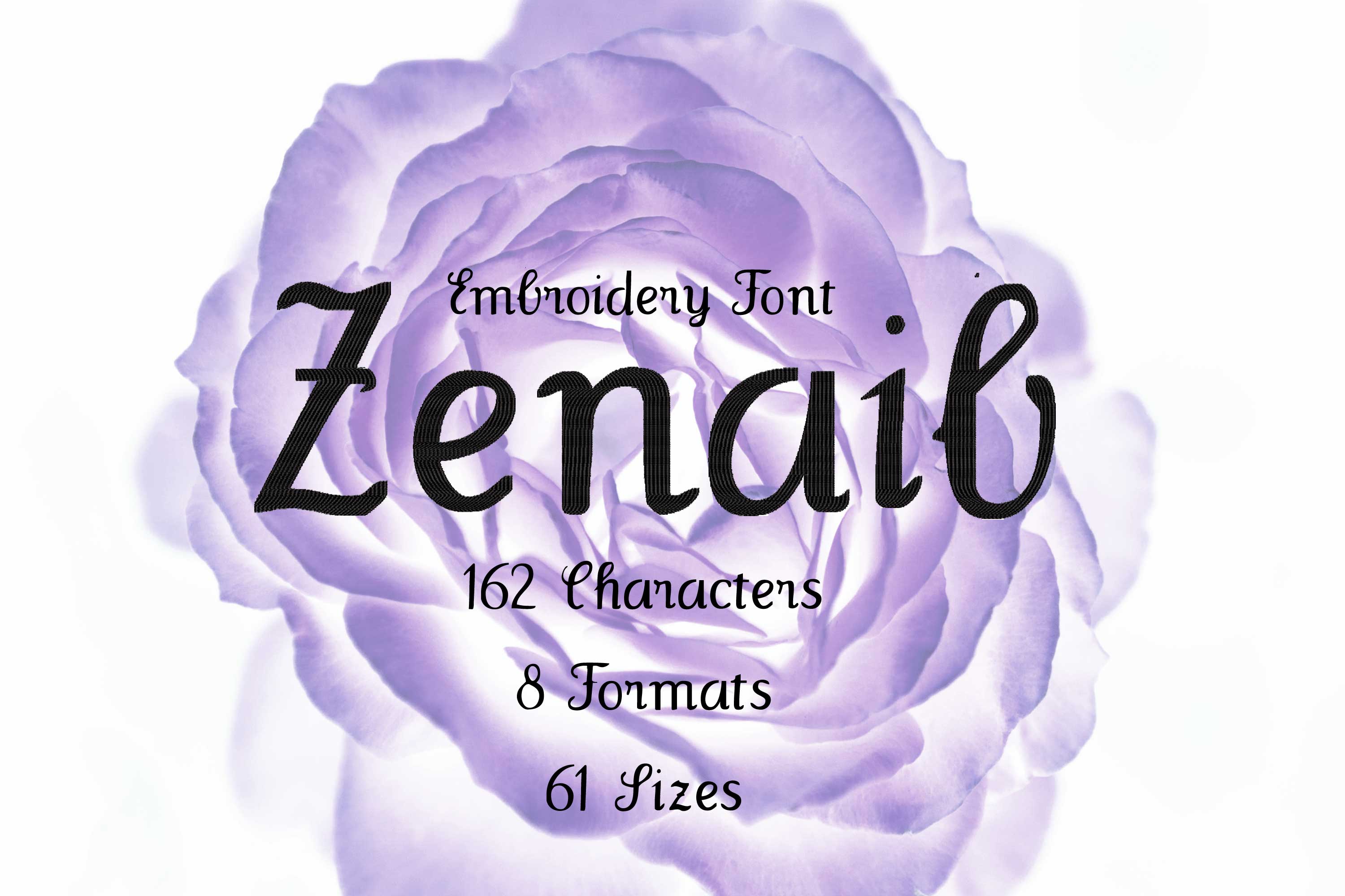
Zenaib Handwritten Letter Style
A sans serif (DIN 16518) or grotesque (French for "without serif", "sans serif") is a font family derived from antiqua, which is characterized by the fact that it has no serifs. In addition, in grotesque fonts, the stroke width of the letters is (almost) uniform, so stroke contrast is absent or very slight. The absence of serifs distinguishes grotesque fonts from serifed linear antiqua. The term grotesque is very common among experts. It refers to the fact that the first typefaces of this type were considered grotesque, i.e. a strange but quite charming distortion, because the non-variation of stroke width and the omission of serifs contradicted all reading habits of the time. Grotesque fonts feature simply shaped glyphs that can be easily displayed on screens, among other things. They are therefore standard on computer systems today. Since the widespread use of grotesque fonts, the term Grotesk seems strange, which is why the terms sans serif or Sans Serif are commonly used in the desktop publishing industry.Product Number: F00177Product Name: ZenaibThis design comes with the following sizes:from 0.5" to 8" in steps of 0.125"162 Characters 61 Sizes 8 FormatsThe following formats are included in the file you will receive: .DST .EXP .JEF .PES .VP3 .XXX .PEC .U01You MUST have an embroidery machine and the software needed to transfer it from your computer to the machine to use this file. This listing is for the machine file only - not a finished item.Zenaib Handwritten Letter Style Sans Serif Machine Embroidery Font Design, Grotesque Font Embroidery Pattern, Without Serif Font Design, Downloadable Fonts, Alphabet Design, Typography Design, Typeface, Letter Style, Unique Digital Supplies For Embroidery Machines
US$1.10* US$4.40* (75% saved)
%
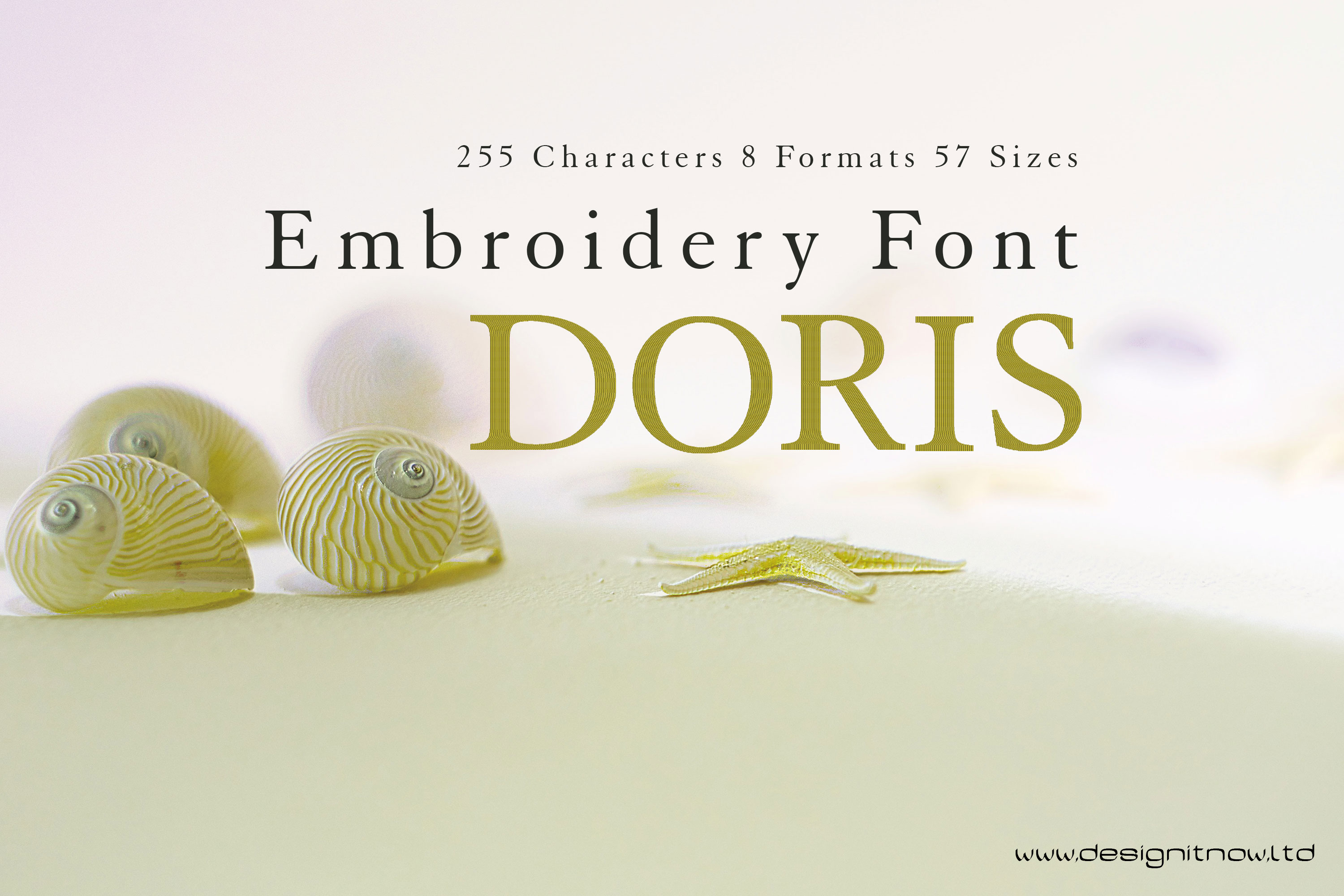
Doris Serif Letters Font
In microtypography, a serif is a short, thin line on the lines of letters and characters, which in antiqua typefaces terminates a letter stroke at the end, at right angles to its basic direction as a horizontal stroke (stroke, foot). The serif typeface is primarily used for the main text of books and magazines, since in printed form this typeface is in many cases less tiring and easier to read than sans serif typefaces. A well-known serif font (also called a serif font) is Times; a well-known sans-serif font is Helvetica. The Duden and the Oxford English Dictionary cite the Dutch schreef "stroke, line" as the presumed word origin, although the word used in German is additionally assumed to be borrowed from the corresponding English word. Depending on where and how the serif ends the stroke of a glyph, a distinction is made between end serifs, roof serifs, head serifs, cross serifs, and stance serifs. Serifs can be one-sided or double-sided. One-sided serifs are also called half serifs. For example, the lowercase letter k has a single-sided badger serif at the top left, a double-sided closing serif at the top right, a double-sided standing serif at the bottom left, and either a single-sided or double-sided standing serif at the bottom right. In microtypography, serifs are referred to in more detail by a variety of other terms, depending on their exact form.Font is a set of characters designed in a specific typeface and realized according to the respective technical conditions. It is used for text creation and processing, typesetting and printing, and forms the basis of typography. A typesetting font consists of individual characters, the glyphs: usually lowercase letters, uppercase letters, umlauts, accented characters, numerals, ligatures, punctuation marks, special characters and small caps. These are assembled manually, by machine or electronically to form words, lines and more complex orders.The scope of such a character set depends on the technology and the intended application radius of a typesetting font. The functional efficiency of the characters of a typesetting script requires, in the case of Western European alphabetic scripts, that they are arranged horizontally, in neighborhood with other characters of the inventory, according to a uniform rhythmic and stylistic principle. Only then can they be combined into a coherent, graphically balanced typeface.The form of typefaces in general, and that of typesetting in particular, is characterized by two different modes of access: Reading and seeing (in the sense of looking). These are due to the "double character of writing." Writing is both abstract (semantic level) and sensuously concrete (semiotic level). In routine reading, attention is focused on the abstract side of writing. Records in alphabetical writing are not deciphered letter by letter, but word and line outlines are grasped holistically by means of eye jumps (saccades). In the process, details of the form of the written image escape attention, recede into the background, and are not registered or are invisible.Product Number: F01444Product Name: DorisThis design comes with the following sizes:from 1" to 8" in steps of 0.125"255 Characters 57 Sizes 8 FormatsThe following formats are included in the file you will receive: .DST .EXP .JEF .PES .VP3 .XXX .PEC .U01You MUST have an embroidery machine and the software needed to transfer it from your computer to the machine to use this file. This listing is for the machine file only - not a finished item.Doris Serif Letters Machine Embroidery Font Design, Serif Letters Characters, Serif Font Embroidery Pattern, Font Design, Downloadable Fonts, Alphabet Design, Typography Design, Typeface, Letter Style, Unique Digital Supplies For Embroidery Machines
US$1.10* US$4.40* (75% saved)
%
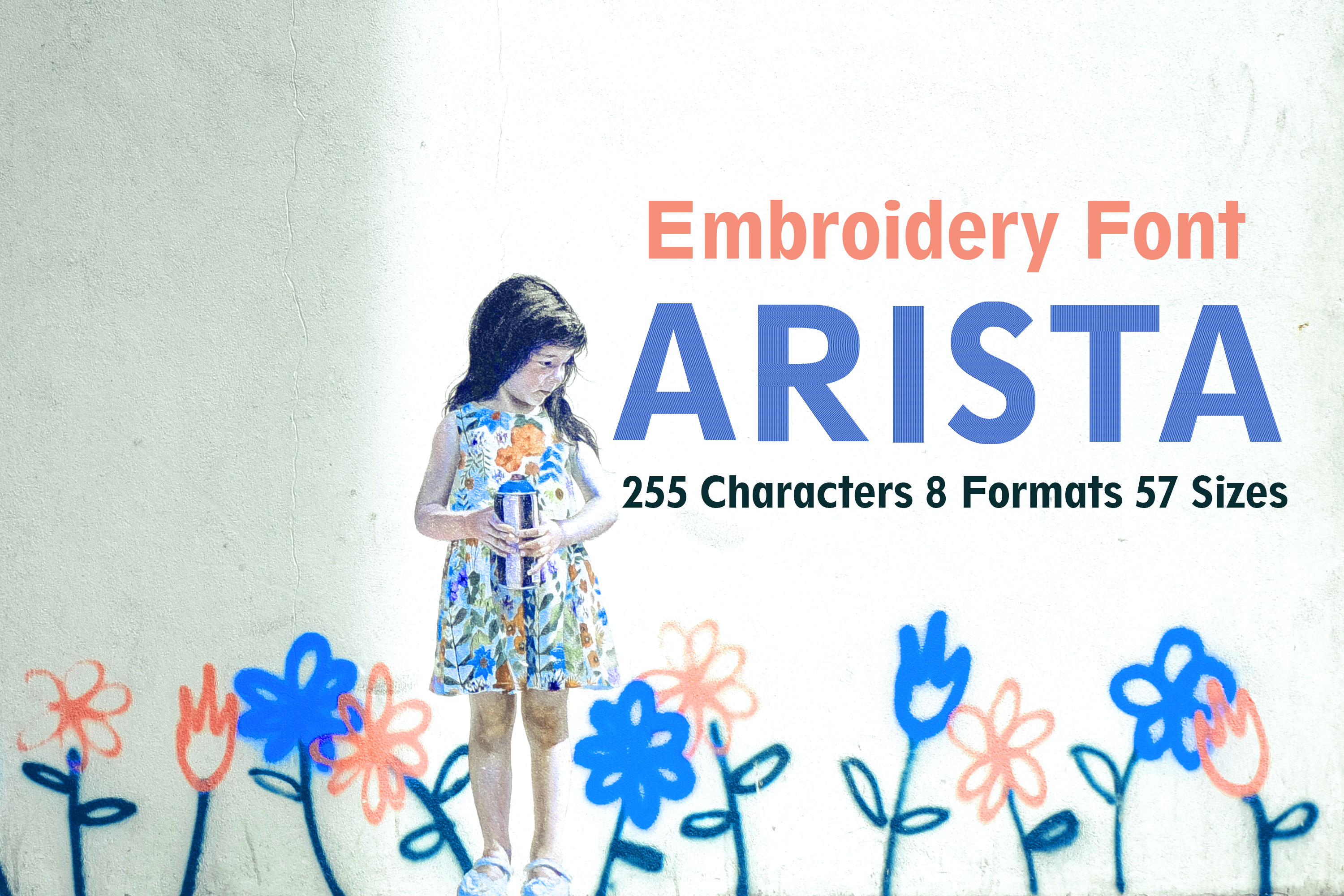
Arista Sans Serif Letters Font
Font is a set of characters designed in a specific typeface and realized according to the respective technical conditions. It is used for text creation and processing, typesetting and printing, and forms the basis of typography. A typesetting font consists of individual characters, the glyphs: usually lowercase letters, uppercase letters, umlauts, accented characters, numerals, ligatures, punctuation marks, special characters and small caps. These are assembled manually, by machine or electronically to form words, lines and more complex orders.Product Number: F01452Product Name: AristaThis design comes with the following sizes:from 1" to 8" in steps of 0.125"255 Characters 57 Sizes 8 FormatsThe following formats are included in the file you will receive: .DST .EXP .JEF .PES .VP3 .XXX .PEC .U01You MUST have an embroidery machine and the software needed to transfer it from your computer to the machine to use this file. This listing is for the machine file only - not a finished item.Arista Basic Sans Serif Letters Machine Embroidery Font Design, Embroidery Pattern, Font Design, Downloadable Fonts, Alphabet Design, Typography Design, Typeface, Letter Style, Quality Digital Supplies For Embroidery Machines
US$1.10* US$4.40* (75% saved)
%
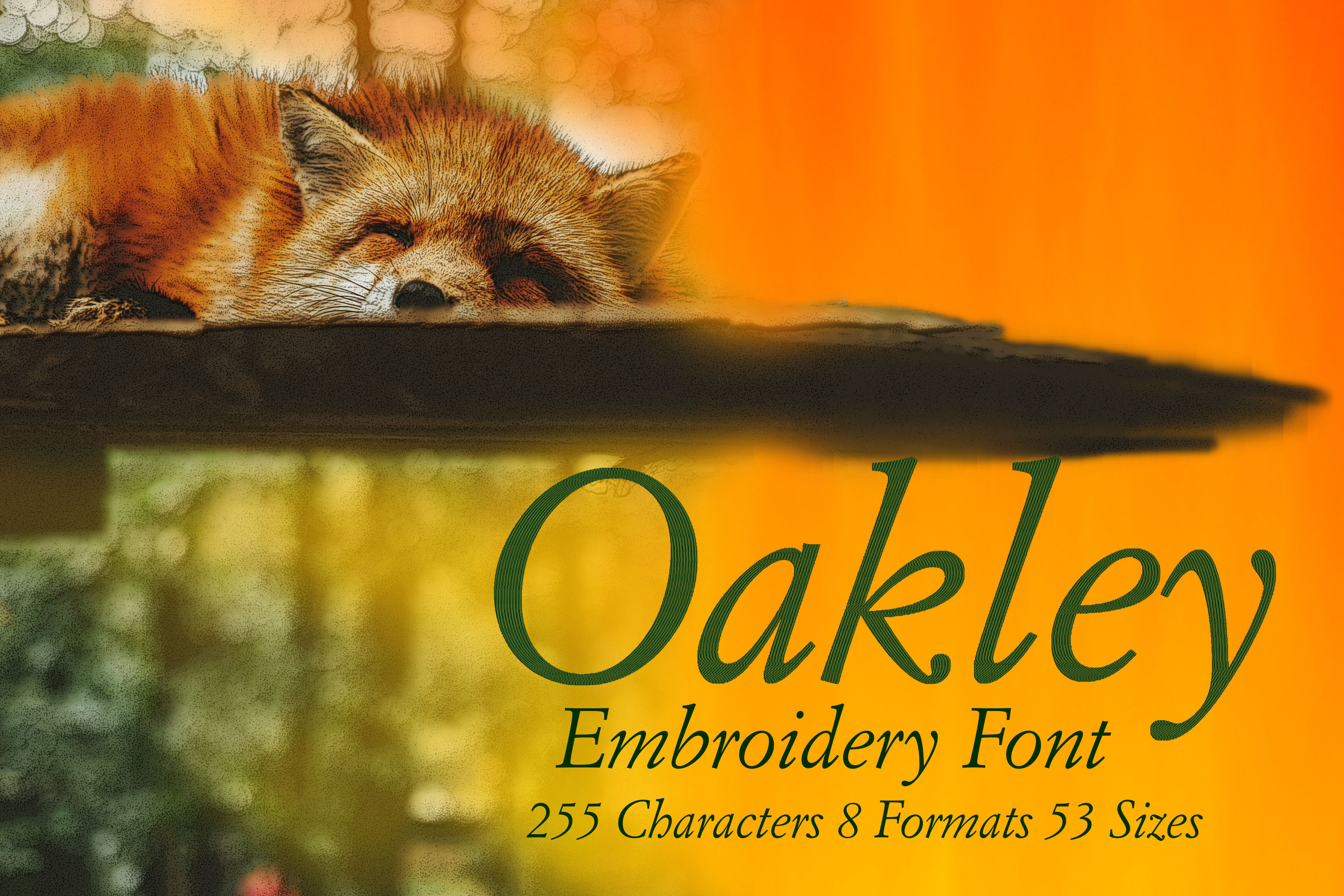
Oakley Cursive Letters Font
In microtypography, a serif is a short, thin line on the lines of letters and characters, which in antiqua typefaces terminates a letter stroke at the end, at right angles to its basic direction as a horizontal stroke (stroke, foot). The serif typeface is primarily used for the main text of books and magazines, since in printed form this typeface is in many cases less tiring and easier to read than sans serif typefaces. A well-known serif font (also called a serif font) is Times; a well-known sans-serif font is Helvetica. The Duden and the Oxford English Dictionary cite the Dutch schreef "stroke, line" as the presumed word origin, although the word used in German is additionally assumed to be borrowed from the corresponding English word. Depending on where and how the serif ends the stroke of a glyph, a distinction is made between end serifs, roof serifs, head serifs, cross serifs, and stance serifs. Serifs can be one-sided or double-sided. One-sided serifs are also called half serifs. For example, the lowercase letter k has a single-sided badger serif at the top left, a double-sided closing serif at the top right, a double-sided standing serif at the bottom left, and either a single-sided or double-sided standing serif at the bottom right. In microtypography, serifs are referred to in more detail by a variety of other terms, depending on their exact form.Font is a set of characters designed in a specific typeface and realized according to the respective technical conditions. It is used for text creation and processing, typesetting and printing, and forms the basis of typography. A typesetting font consists of individual characters, the glyphs: usually lowercase letters, uppercase letters, umlauts, accented characters, numerals, ligatures, punctuation marks, special characters and small caps. These are assembled manually, by machine or electronically to form words, lines and more complex orders.Product Number: F01453Product Name: OakleyThis design comes with the following sizes:from 1.5" to 8" in steps of 0.125"255 Characters 53 Sizes 8 FormatsThe following formats are included in the file you will receive: .DST .EXP .JEF .PES .VP3 .XXX .PEC .U01You MUST have an embroidery machine and the software needed to transfer it from your computer to the machine to use this file. This listing is for the machine file only - not a finished item.Oakley Cursive Serif Letters Machine Embroidery Font Design, Serif Letters Characters, Serif Font Embroidery Pattern, Font Design, Downloadable Fonts, Alphabet Design, Typography Design, Typeface, Letter Style, Unique Digital Supplies For Embroidery Machines
US$1.10* US$4.40* (75% saved)
%
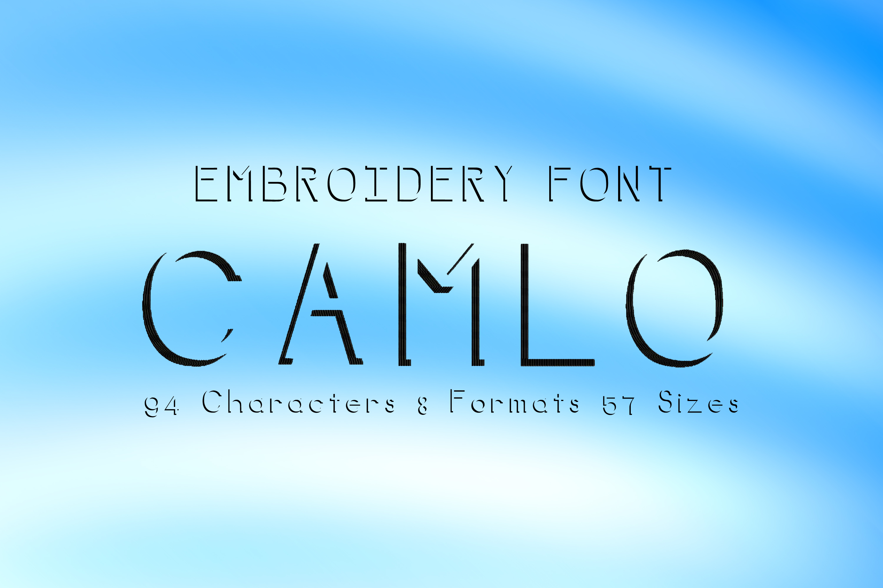
Camlo Beautiful Thin Letters Font
The outline (in art and photography, the contour or silhouette) of an object is, for an observer, a curve that delineates the object from its surroundings. The word component crack (from "ritzen", "tear") has the meaning "drawing", as in elevation, ground plan or oblique section. The outline of an object depends not only on the shape of the object, but also on the direction from which an observer observes the object. In descriptive geometry, one represents curved surfaces by constructing their outlines.In art, a silhouette draws a viewer's attention to the outline of an object or person that is important to the artist. This is also called a silhouette. In photography, backlighting is used to emphasize the silhouettes of objects. In image processing, outlines of objects play an essential role in tracking moving objects. In graphic representation, simplified outlines of objects appear in pictograms.The inner contours differentiate the inner space of a larger outer contour of an object or figure. For example, the silhouette of an apple may serve as an outer contour, with a worm drawn inside it in an inner contour. In drawings with pure outer and inner contours, however, there are no hatchings or lines in general to represent the visible volume of the bodies. Therefore, drawings of this kind usually appear relatively flat, although overlaps and differences in size and height (= simple spatial means) can already create a pictorial space.Font is a set of characters designed in a specific typeface and realized according to the respective technical conditions. It is used for text creation and processing, typesetting and printing, and forms the basis of typography. A typesetting font consists of individual characters, the glyphs: usually lowercase letters, uppercase letters, umlauts, accented characters, numerals, ligatures, punctuation marks, special characters and small caps. These are assembled manually, by machine or electronically to form words, lines and more complex orders.Product Number: F00382Product Name: CamloThis design comes with the following sizes:from 1" to 8" in steps of 0.125"94 Characters 57 Sizes 8 FormatsThe following formats are included in the file you will receive: .DST .EXP .JEF .PES .VP3 .XXX .PEC .U01You MUST have an embroidery machine and the software needed to transfer it from your computer to the machine to use this file. This listing is for the machine file only - not a finished item.Camlo Beautiful Thin Letters Outlined Machine Embroidery Font Design, Contour Font, Outer Contour Letters Embroidery Pattern, Font Design, Downloadable Fonts, Alphabet Design, Typography Design, Typeface, Letter Style, Unique Digital Supplies For Embroidery Machines
US$1.10* US$4.40* (75% saved)
%
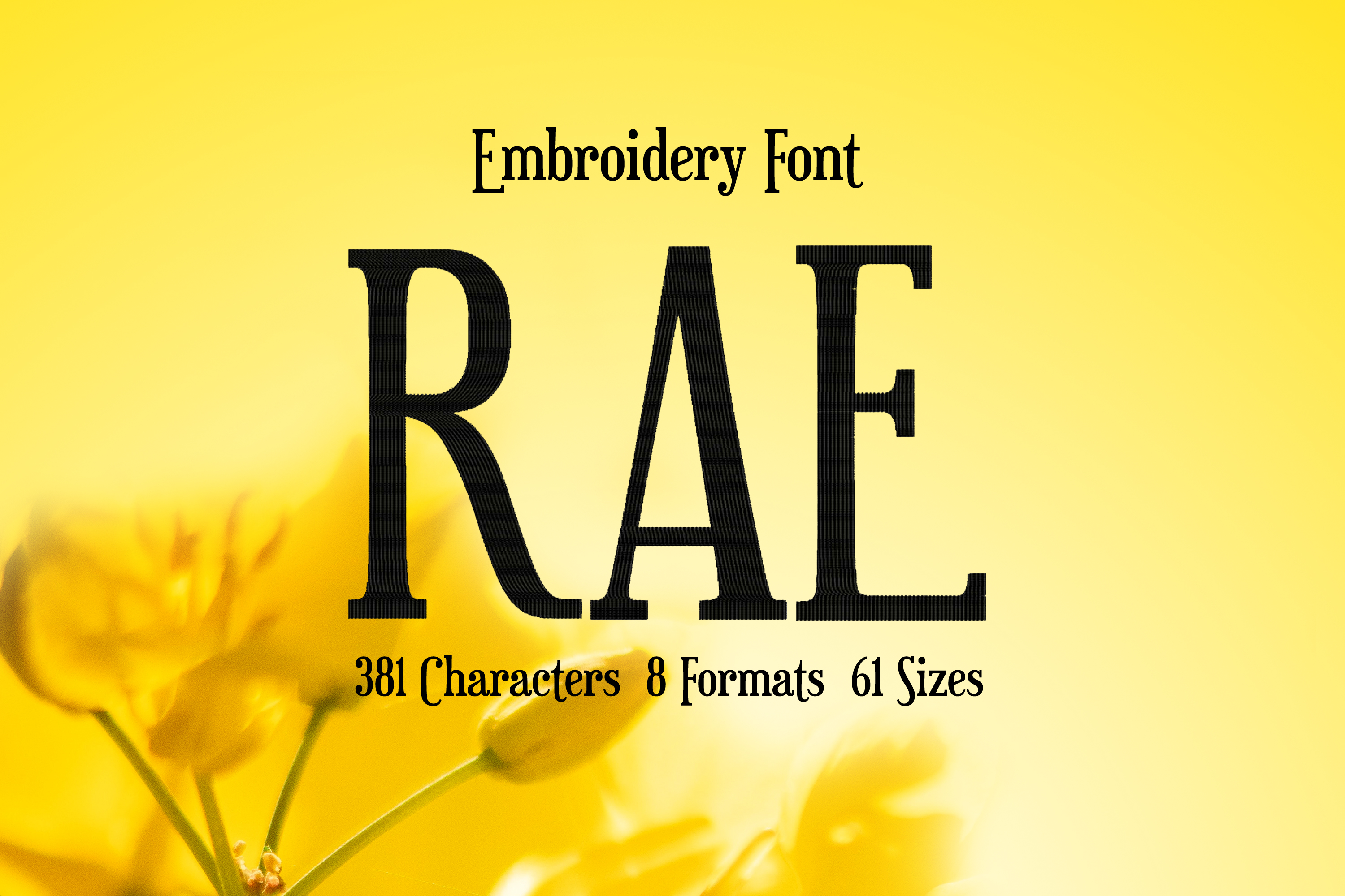
Rae Thin Serif Letters Font
In microtypography, a serif is a short, thin line on the lines of letters and characters, which in antiqua typefaces terminates a letter stroke at the end, at right angles to its basic direction as a horizontal stroke (stroke, foot). The serif typeface is primarily used for the main text of books and magazines, since in printed form this typeface is in many cases less tiring and easier to read than sans serif typefaces. A well-known serif font (also called a serif font) is Times; a well-known sans-serif font is Helvetica. The Duden and the Oxford English Dictionary cite the Dutch schreef "stroke, line" as the presumed word origin, although the word used in German is additionally assumed to be borrowed from the corresponding English word. Depending on where and how the serif ends the stroke of a glyph, a distinction is made between end serifs, roof serifs, head serifs, cross serifs, and stance serifs. Serifs can be one-sided or double-sided. One-sided serifs are also called half serifs. For example, the lowercase letter k has a single-sided badger serif at the top left, a double-sided closing serif at the top right, a double-sided standing serif at the bottom left, and either a single-sided or double-sided standing serif at the bottom right. In microtypography, serifs are referred to in more detail by a variety of other terms, depending on their exact form.Font is a set of characters designed in a specific typeface and realized according to the respective technical conditions. It is used for text creation and processing, typesetting and printing, and forms the basis of typography. A typesetting font consists of individual characters, the glyphs: usually lowercase letters, uppercase letters, umlauts, accented characters, numerals, ligatures, punctuation marks, special characters and small caps. These are assembled manually, by machine or electronically to form words, lines and more complex orders.The scope of such a character set depends on the technology and the intended application radius of a typesetting font. The functional efficiency of the characters of a typesetting script requires, in the case of Western European alphabetic scripts, that they are arranged horizontally, in neighborhood with other characters of the inventory, according to a uniform rhythmic and stylistic principle. Only then can they be combined into a coherent, graphically balanced typeface.The form of typefaces in general, and that of typesetting in particular, is characterized by two different modes of access: Reading and seeing (in the sense of looking). These are due to the "double character of writing." Writing is both abstract (semantic level) and sensuously concrete (semiotic level). In routine reading, attention is focused on the abstract side of writing. Records in alphabetical writing are not deciphered letter by letter, but word and line outlines are grasped holistically by means of eye jumps (saccades). In the process, details of the form of the written image escape attention, recede into the background, and are not registered or are invisible.Product Number: F00556Product Name: RaeThis design comes with the following sizes:from 0.5" to 8" in steps of 0.125"381 Characters 61 Sizes 8 FormatsThe following formats are included in the file you will receive: .DST .EXP .JEF .PES .VP3 .XXX .PEC .U01You MUST have an embroidery machine and the software needed to transfer it from your computer to the machine to use this file. This listing is for the machine file only - not a finished item.Rae Thin Serif Letters Machine Embroidery Font Design, Serif Letters Characters, Serif Font Embroidery Pattern, Font Design, Downloadable Fonts, Alphabet Design, Typography Design, Typeface, Letter Style, Unique Digital Supplies For Embroidery Machines
US$1.10* US$4.40* (75% saved)
%
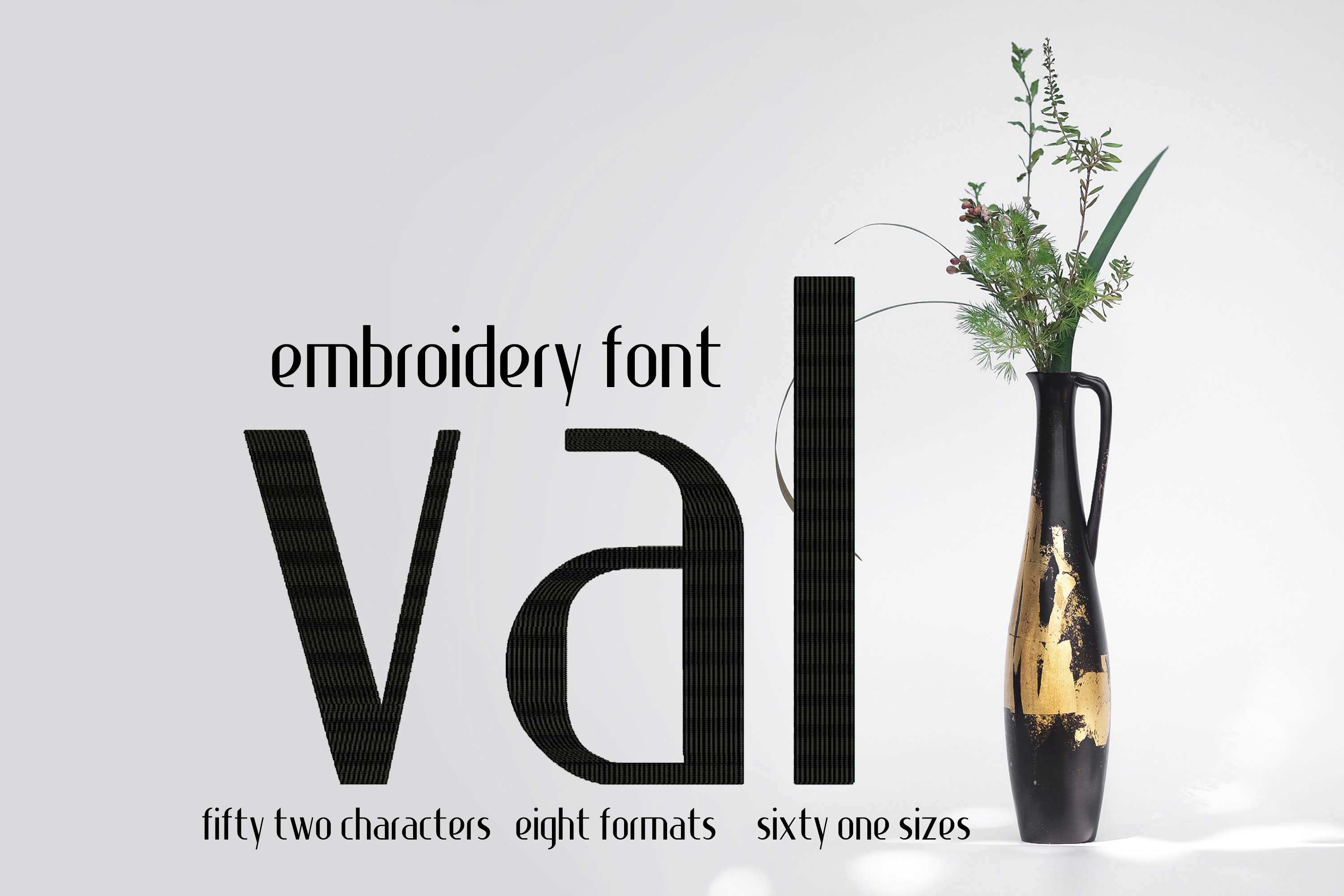
Val Fine Thin Letters Font
Font is a set of characters designed in a specific typeface and realized according to the respective technical conditions. It is used for text creation and processing, typesetting and printing, and forms the basis of typography. A typesetting font consists of individual characters, the glyphs: usually lowercase letters, uppercase letters, umlauts, accented characters, numerals, ligatures, punctuation marks, special characters and small caps. These are assembled manually, by machine or electronically to form words, lines and more complex orders.Product Number: F00226Product Name: ValThis design comes with the following sizes:from 0.5" to 8" in steps of 0.125"52 Characters 61 Sizes 8 FormatsThe following formats are included in the file you will receive: .DST .EXP .JEF .PES .VP3 .XXX .PEC .U01You MUST have an embroidery machine and the software needed to transfer it from your computer to the machine to use this file. This listing is for the machine file only - not a finished item.Val Fine Thin Letters Machine Embroidery Font Design, Embroidery Pattern, Font Design, Downloadable Fonts, Alphabet Design, Typography Design, Typeface, Letter Style, Quality Digital Supplies For Embroidery Machines
US$1.10* US$4.40* (75% saved)
%
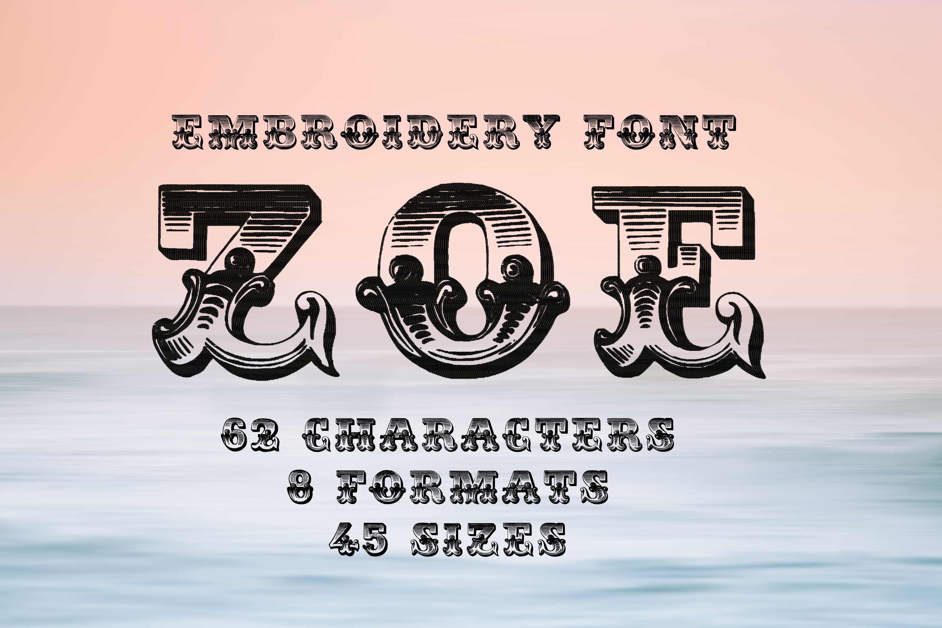
Zoe Vintage Initials Letters Font
In microtypography, a serif is a short, thin line on the lines of letters and characters, which in antiqua typefaces terminates a letter stroke at the end, at right angles to its basic direction as a horizontal stroke (stroke, foot). The serif typeface is primarily used for the main text of books and magazines, since in printed form this typeface is in many cases less tiring and easier to read than sans serif typefaces. A well-known serif font (also called a serif font) is Times; a well-known sans-serif font is Helvetica. The Duden and the Oxford English Dictionary cite the Dutch schreef "stroke, line" as the presumed word origin, although the word used in German is additionally assumed to be borrowed from the corresponding English word. Depending on where and how the serif ends the stroke of a glyph, a distinction is made between end serifs, roof serifs, head serifs, cross serifs, and stance serifs. Serifs can be one-sided or double-sided. One-sided serifs are also called half serifs. For example, the lowercase letter k has a single-sided badger serif at the top left, a double-sided closing serif at the top right, a double-sided standing serif at the bottom left, and either a single-sided or double-sided standing serif at the bottom right. In microtypography, serifs are referred to in more detail by a variety of other terms, depending on their exact form.Font is a set of characters designed in a specific typeface and realized according to the respective technical conditions. It is used for text creation and processing, typesetting and printing, and forms the basis of typography. A typesetting font consists of individual characters, the glyphs: usually lowercase letters, uppercase letters, umlauts, accented characters, numerals, ligatures, punctuation marks, special characters and small caps. These are assembled manually, by machine or electronically to form words, lines and more complex orders.The scope of such a character set depends on the technology and the intended application radius of a typesetting font. The functional efficiency of the characters of a typesetting script requires, in the case of Western European alphabetic scripts, that they are arranged horizontally, in neighborhood with other characters of the inventory, according to a uniform rhythmic and stylistic principle. Only then can they be combined into a coherent, graphically balanced typeface.The form of typefaces in general, and that of typesetting in particular, is characterized by two different modes of access: Reading and seeing (in the sense of looking). These are due to the "double character of writing." Writing is both abstract (semantic level) and sensuously concrete (semiotic level). In routine reading, attention is focused on the abstract side of writing. Records in alphabetical writing are not deciphered letter by letter, but word and line outlines are grasped holistically by means of eye jumps (saccades). In the process, details of the form of the written image escape attention, recede into the background, and are not registered or are invisible.Product Number: F00308Product Name: ZoeThis design comes with the following sizes:from 2.5" to 8" in steps of 0.125"62 Characters 45 Sizes 8 FormatsThe following formats are included in the file you will receive: .DST .EXP .JEF .PES .VP3 .XXX .PEC .U01You MUST have an embroidery machine and the software needed to transfer it from your computer to the machine to use this file. This listing is for the machine file only - not a finished item.Zoe Vintage Initials Letters Serif Machine Embroidery Font Design, Serif Letters Characters, Serif Font Embroidery Pattern, Font Design, Downloadable Fonts, Alphabet Design, Typography Design, Typeface, Letter Style, Unique Digital Supplies For Embroidery Machines
US$1.10* US$4.40* (75% saved)
%
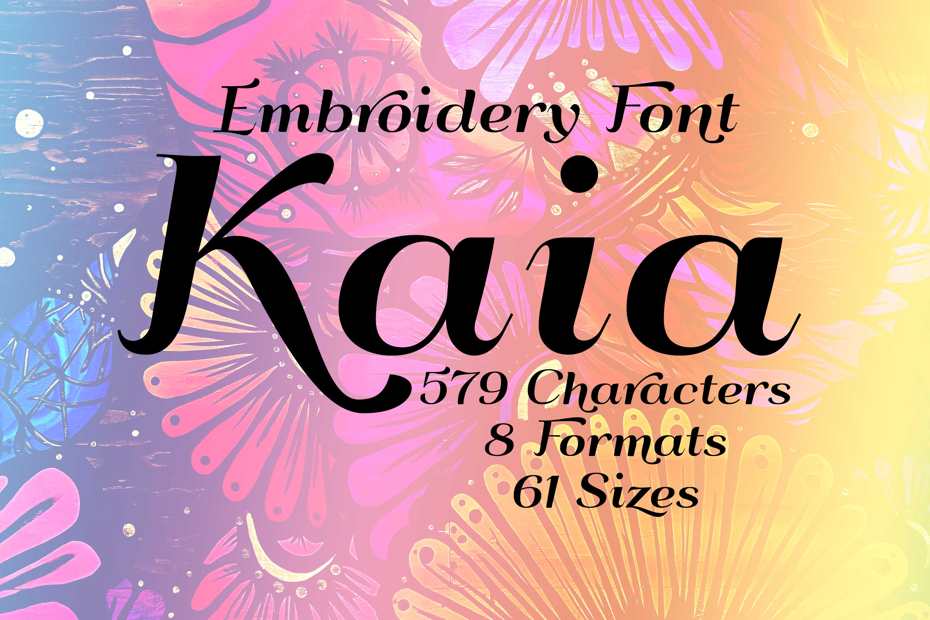
Kaia Basic Elegant Font
In microtypography, a serif is a short, thin line on the lines of letters and characters, which in antiqua typefaces terminates a letter stroke at the end, at right angles to its basic direction as a horizontal stroke (stroke, foot). The serif typeface is primarily used for the main text of books and magazines, since in printed form this typeface is in many cases less tiring and easier to read than sans serif typefaces. A well-known serif font (also called a serif font) is Times; a well-known sans-serif font is Helvetica. The Duden and the Oxford English Dictionary cite the Dutch schreef "stroke, line" as the presumed word origin, although the word used in German is additionally assumed to be borrowed from the corresponding English word. Depending on where and how the serif ends the stroke of a glyph, a distinction is made between end serifs, roof serifs, head serifs, cross serifs, and stance serifs. Serifs can be one-sided or double-sided. One-sided serifs are also called half serifs. For example, the lowercase letter k has a single-sided badger serif at the top left, a double-sided closing serif at the top right, a double-sided standing serif at the bottom left, and either a single-sided or double-sided standing serif at the bottom right. In microtypography, serifs are referred to in more detail by a variety of other terms, depending on their exact form.Font is a set of characters designed in a specific typeface and realized according to the respective technical conditions. It is used for text creation and processing, typesetting and printing, and forms the basis of typography. A typesetting font consists of individual characters, the glyphs: usually lowercase letters, uppercase letters, umlauts, accented characters, numerals, ligatures, punctuation marks, special characters and small caps. These are assembled manually, by machine or electronically to form words, lines and more complex orders.The scope of such a character set depends on the technology and the intended application radius of a typesetting font. The functional efficiency of the characters of a typesetting script requires, in the case of Western European alphabetic scripts, that they are arranged horizontally, in neighborhood with other characters of the inventory, according to a uniform rhythmic and stylistic principle. Only then can they be combined into a coherent, graphically balanced typeface.The form of typefaces in general, and that of typesetting in particular, is characterized by two different modes of access: Reading and seeing (in the sense of looking). These are due to the "double character of writing." Writing is both abstract (semantic level) and sensuously concrete (semiotic level). In routine reading, attention is focused on the abstract side of writing. Records in alphabetical writing are not deciphered letter by letter, but word and line outlines are grasped holistically by means of eye jumps (saccades). In the process, details of the form of the written image escape attention, recede into the background, and are not registered or are invisible.Product Number: F00157Product Name: KaiaThis design comes with the following sizes:from 0.5" to 8" in steps of 0.125"579 Characters 61 Sizes 8 FormatsThe following formats are included in the file you will receive: .DST .EXP .JEF .PES .VP3 .XXX .PEC .U01You MUST have an embroidery machine and the software needed to transfer it from your computer to the machine to use this file. This listing is for the machine file only - not a finished item.Kaia Basic Elegant Serif Machine Embroidery Font Design, Serif Letters Characters, Serif Font Embroidery Pattern, Font Design, Downloadable Fonts, Alphabet Design, Typography Design, Typeface, Letter Style, Unique Digital Supplies For Embroidery Machines
US$1.10* US$4.40* (75% saved)

