US$1.10*
% US$4.40* (75% saved)Free shipping
Product number: F01444
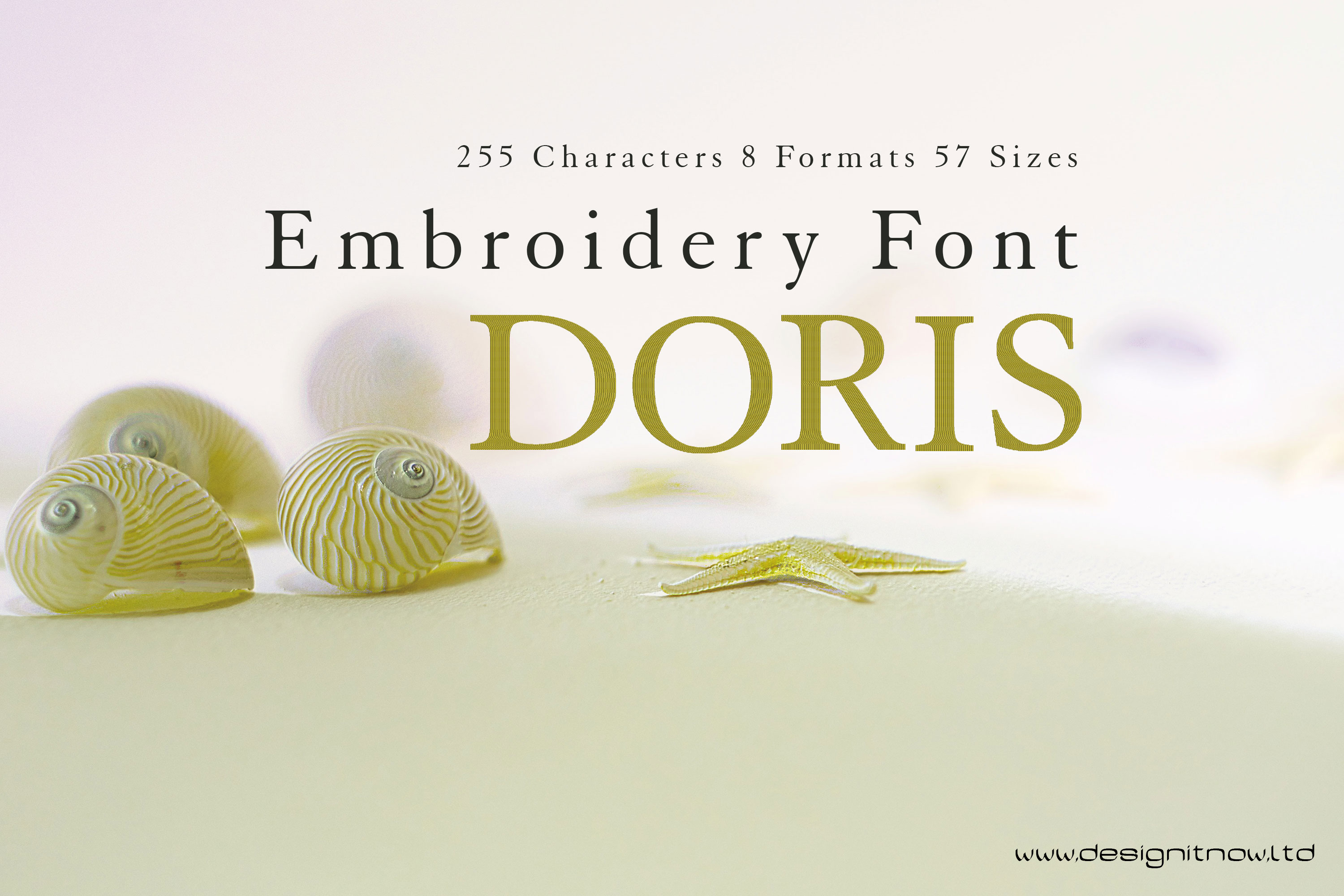
Product information "Doris Serif Letters Font"
In microtypography, a serif is a short, thin line on the lines of letters and characters, which in antiqua typefaces terminates a letter stroke at the end, at right angles to its basic direction as a horizontal stroke (stroke, foot). The serif typeface is primarily used for the main text of books and magazines, since in printed form this typeface is in many cases less tiring and easier to read than sans serif typefaces. A well-known serif font (also called a serif font) is Times; a well-known sans-serif font is Helvetica. The Duden and the Oxford English Dictionary cite the Dutch schreef "stroke, line" as the presumed word origin, although the word used in German is additionally assumed to be borrowed from the corresponding English word. Depending on where and how the serif ends the stroke of a glyph, a distinction is made between end serifs, roof serifs, head serifs, cross serifs, and stance serifs. Serifs can be one-sided or double-sided.
One-sided serifs are also called half serifs. For example, the lowercase letter k has a single-sided badger serif at the top left, a double-sided closing serif at the top right, a double-sided standing serif at the bottom left, and either a single-sided or double-sided standing serif at the bottom right. In microtypography, serifs are referred to in more detail by a variety of other terms, depending on their exact form.
Font is a set of characters designed in a specific typeface and realized according to the respective technical conditions. It is used for text creation and processing, typesetting and printing, and forms the basis of typography. A typesetting font consists of individual characters, the glyphs: usually lowercase letters, uppercase letters, umlauts, accented characters, numerals, ligatures, punctuation marks, special characters and small caps. These are assembled manually, by machine or electronically to form words, lines and more complex orders.
The scope of such a character set depends on the technology and the intended application radius of a typesetting font. The functional efficiency of the characters of a typesetting script requires, in the case of Western European alphabetic scripts, that they are arranged horizontally, in neighborhood with other characters of the inventory, according to a uniform rhythmic and stylistic principle. Only then can they be combined into a coherent, graphically balanced typeface.
The form of typefaces in general, and that of typesetting in particular, is characterized by two different modes of access: Reading and seeing (in the sense of looking). These are due to the "double character of writing." Writing is both abstract (semantic level) and sensuously concrete (semiotic level). In routine reading, attention is focused on the abstract side of writing. Records in alphabetical writing are not deciphered letter by letter, but word and line outlines are grasped holistically by means of eye jumps (saccades). In the process, details of the form of the written image escape attention, recede into the background, and are not registered or are invisible.
Product Number: F01444
Product Name: Doris
This design comes with the following sizes:
- from 1" to 8" in steps of 0.125"
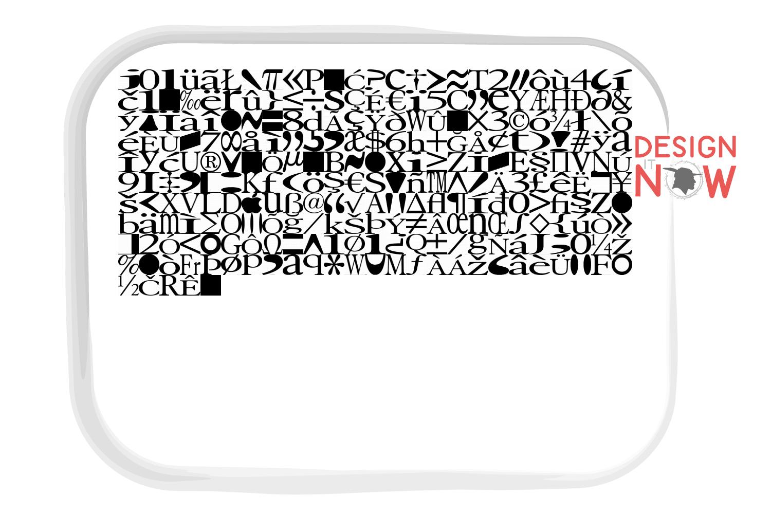
- 255 Characters
- 57 Sizes
- 8 Formats
The following formats are included in the file you will receive: .DST .EXP .JEF .PES .VP3 .XXX .PEC .U01
You MUST have an embroidery machine and the software needed to transfer it from your computer to the machine to use this file. This listing is for the machine file only - not a finished item.
Doris Serif Letters Machine Embroidery Font Design, Serif Letters Characters, Serif Font Embroidery Pattern, Font Design, Downloadable Fonts, Alphabet Design, Typography Design, Typeface, Letter Style, Unique Digital Supplies For Embroidery Machines


