US$1.10*
% US$4.40* (75% saved)Free shipping
Product number: F00522
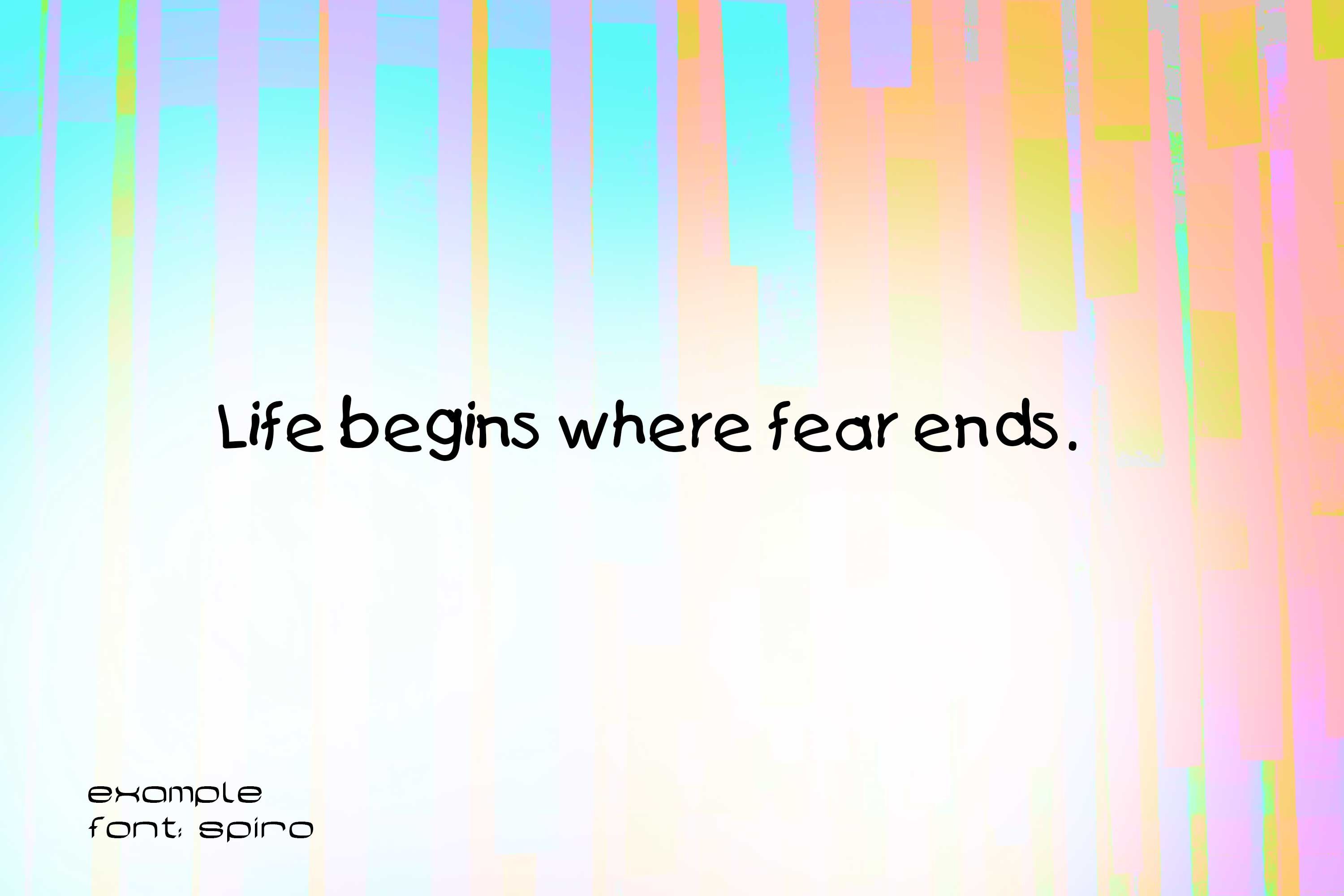
Product information "Spiro Cartoon Letters Font"
A sans serif (DIN 16518) or grotesque (French for "without serif", "sans serif") is a font family derived from antiqua, which is characterized by the fact that it has no serifs. In addition, in grotesque fonts, the stroke width of the letters is (almost) uniform, so stroke contrast is absent or very slight. The absence of serifs distinguishes grotesque fonts from serifed linear antiqua. The term grotesque is very common among experts. It refers to the fact that the first typefaces of this type were considered grotesque, i.e. a strange but quite charming distortion, because the non-variation of stroke width and the omission of serifs contradicted all reading habits of the time. Grotesque fonts feature simply shaped glyphs that can be easily displayed on screens, among other things. They are therefore standard on computer systems today. Since the widespread use of grotesque fonts, the term Grotesk seems strange, which is why the terms sans serif or Sans Serif are commonly used in the desktop publishing industry.
Like Egyptienne, Grotesk originated in England in the early 19th century in response to the increased need for eye-catching advertising typefaces. In 1803, Robert Thorne showed a sans serif for the first time. The first Grotesk was published in 1816 by William Caslon IV, the great-grandson of the type founder William Caslon. At first glance, grotesque fonts have a uniform stroke width. However, this only appears to be the case, because in reality the weights almost always differ in order to create a visually uniform image.
Font is a set of characters designed in a specific typeface and realized according to the respective technical conditions. It is used for text creation and processing, typesetting and printing, and forms the basis of typography. A typesetting font consists of individual characters, the glyphs: usually lowercase letters, uppercase letters, umlauts, accented characters, numerals, ligatures, punctuation marks, special characters and small caps. These are assembled manually, by machine or electronically to form words, lines and more complex orders.
The scope of such a character set depends on the technology and the intended application radius of a typesetting font. The functional efficiency of the characters of a typesetting script requires, in the case of Western European alphabetic scripts, that they are arranged horizontally, in neighborhood with other characters of the inventory, according to a uniform rhythmic and stylistic principle. Only then can they be combined into a coherent, graphically balanced typeface.
The form of typefaces in general, and that of typesetting in particular, is characterized by two different modes of access: Reading and seeing (in the sense of looking). These are due to the "double character of writing." Writing is both abstract (semantic level) and sensuously concrete (semiotic level). In routine reading, attention is focused on the abstract side of writing. Records in alphabetical writing are not deciphered letter by letter, but word and line outlines are grasped holistically by means of eye jumps (saccades). In the process, details of the form of the written image escape attention, recede into the background, and are not registered or are invisible.
Product Number: F00522
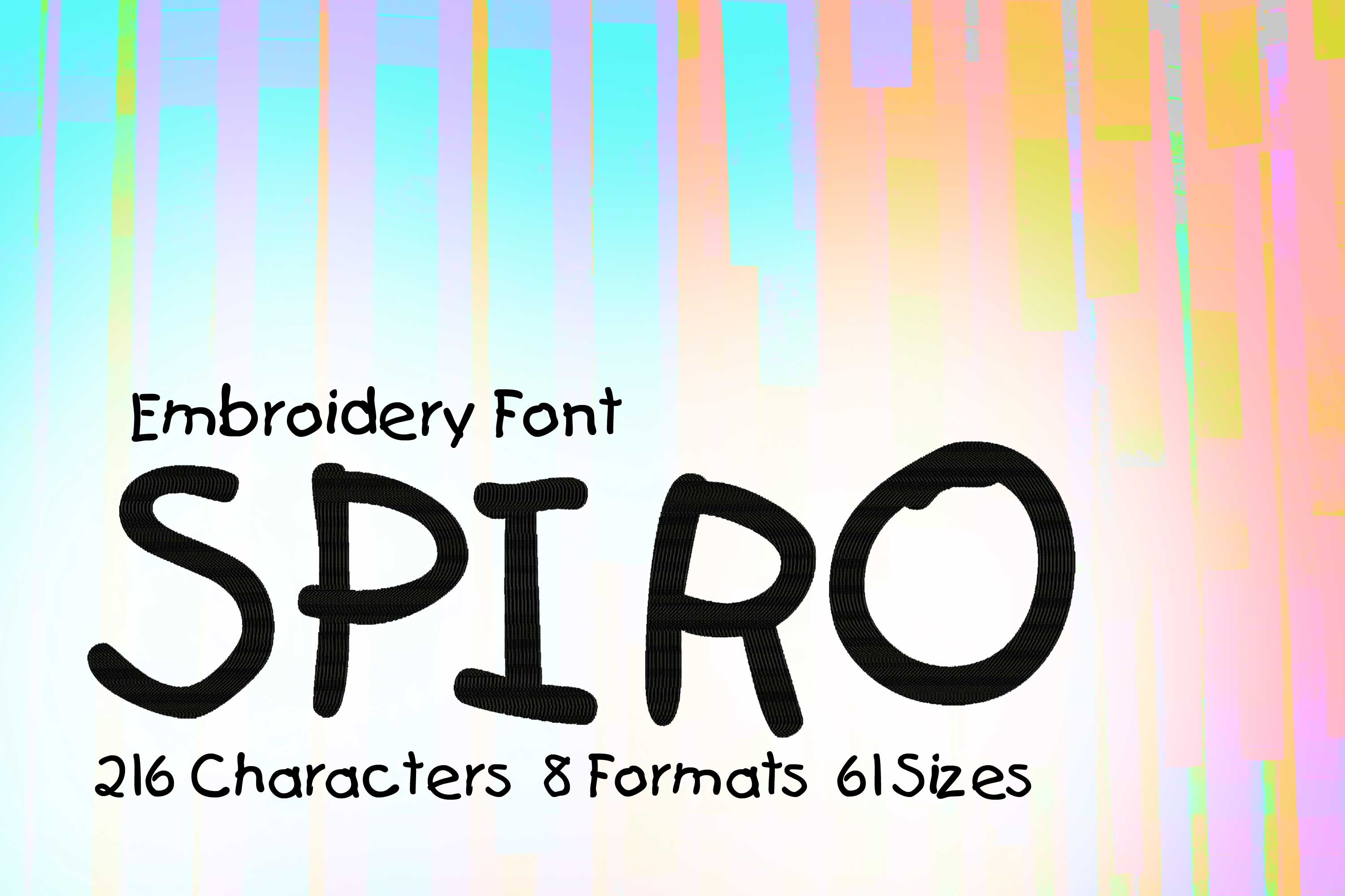
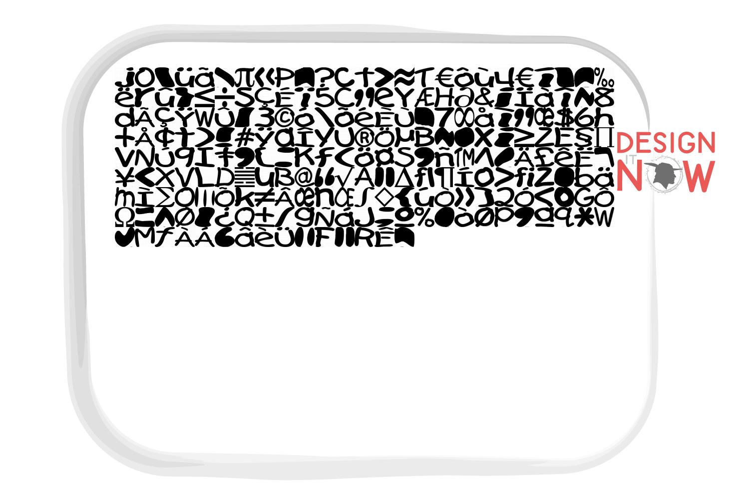
Product Name: Spiro
This design comes with the following sizes:
- from 0.5" to 8" in steps of 0.125"
- 216 Characters
- 61 Sizes
- 8 Formats
The following formats are included in the file you will receive: .DST .EXP .JEF .PES .VP3 .XXX .PEC .U01
You MUST have an embroidery machine and the software needed to transfer it from your computer to the machine to use this file. This listing is for the machine file only - not a finished item.
Spiro Cartoon Letters Font Sans Serif Machine Embroidery Font Design, Grotesque Font Embroidery Pattern, Without Serif Font Design, Downloadable Fonts, Alphabet Design, Typography Design, Typeface, Letter Style, Unique Digital Supplies For Embroidery Machines

